Monday 17 June 2013

Research On Photographers

Research On Photographers

Nick Knight:
Nick Knight is a British Fashion and Documentary Photographer. He was born in 1958 and has three children. He started his career by studying at the Bournemouth and Poole College of arts and design. He is also a web publisher and directed the very famous Lady Gaga’s music video for ‘Born This Way’ which was a huge success. From looking at his work you can match this video to his style of photography it is very unique and quirky. I think Nick Knights style of photography is completely different to things I have seen before, it’s creativity at its finest. However some images appear to be quite strange you can always see how much thought and time he has put into every image to create the outcome he intended. He went on in life to achieve many awards for his work, and you can see why when you look into his photography. I find the images in which he uses bright colours fascinating as someone who prefers black and white images he has made me think otherwise, he also uses a lot of black silhouetted style images with incorporated into solid bold colour. He is a very different style of photographer he dresses the models in extravagant outfits with hairstyles to match but yet they seem to work so well.


Rankin:
Rankin, Real name John Rankin Waddell was born in Paisley in 1966. He is a British Portrait and Fashion Photographer. He studied at the Barnfield College Luton and then went on to The London College of Printing. Whilst studying he met Jefferson Hack, they formed a working relationship and then decided to create a magazine with one another. This was called the ‘Dazed and Confused’. Then following on from this Rankin created his own quarterly Magazine names ‘RANK’. One of Rankin’s most famous pieces are up in an exhibition this is formed of 1500 Portraits of today’s British public he invited people to come across the uk to partake in this project. Rankin become very successful and has shot for world-renowned campaigns such as Nike, Rimmell, Hugo Boss, Coca-Cola ect. In 2010 Rankin Travelled to South Africa with the BBC To shoot the Documentary ‘South Africa in Pictures’.


Tuesday 28 May 2013

Specialist Location- Final Images and evaluation.

Specialist Location 

My final idea for the specialist location brief was to create fashion based images that could be used In magazines such as Look and Ellie. However this wasn't the only angle I wanted to take when doing this project fashion comes In all shapes, sizes and forms. So I created a few band shoots, which could be featured In magazines such as karrang and rock sound. Overall I decided I would like to create a fashion shot for each of these categories men, women and band which all could be features when In a spread within a fashion based magazine. I chose to still encorporate band images into my work as this Is something I perticualy focus on as you can see through out all my projects. However I just changed It up slightly to three different styles so they would all fit how I wanted to make this project work.
In the end I think I did stick to my main idea within the planning, but I didn't create all the images I thought about, I am happy with the idea's I went with in the end and think they came back stronger then my original ideas. The oneIi kept with was the grunge style shoot, however instead of doing this outdoors I decided I wanted to use a white backdrop and keep It very plain and simple because the photo was so busy already. 
Here are the 10 images i chosen to submit:
MEN:
Model: Kevin Daos

Model: Sam Hardman


I think the black backdrop with this image works well With the contrast of kevin's skin tone and clothing. I used two sources of lighting one with a snoot on quite strong coming from the left and one soft box on the right to create the brighter effect on his face and for the right of him to be more shaddowed.

WOMEN:

Model: Caroline Grant

Model: Caroline Grant

Model: Caroline Grant


This was my grunge style shoot, As i proviously said I decided to go with a white backdrop so as not to overdo the Image I think it worked well, I chose quite dark colours for the clothing so it would be alternate to the background i kept a black and white theme through out and I feel the balloons created a good prop to use, I was unsure if they would be more of a hinderance towards the image but in the end I'm very glad I used them. I then chose a gingery brown coloured wig I though a black one would be to much to dark for the image and would just merge to much Into her clothing. Her makeup was also done by me i kept the pattern of the ballons also on her eye makeup to keep it consistant and matched her lipstick with her hair.
I don't think i would change much If I were to do this shoot again, Mabey I would try it outside but as I say I'm not sure If this would work well with the image I desired to create. I think this would suit a magazine as I intended due to the style of image  I tried to create a 'going out grunge' look and it seems to be quite fashionable currently. The bottom one may suit an atricle more, as the top one might be to posed, I could try work on this next time to create more of an inbetween of the two.
Band:

De'Nova Band

De'Nova Band
De'Nova Band

De'Nova Band


I really enjoyed shooting with De'Nova as they are friends, I know more insight into the type of people in which they are making it easier for me to shoot with them. I decided to try something different by using smoke bombs outside, this wasn't as easy as I expected it to be! you have to be quick as the smoke doesn't stick around that long also I could have done with using some which are more powerful.
For the inside shoot I chose to try use a prop in this case was the frame, I think this worked well as I can imagine It being used in a magazine and this is what i was aiming for. I think the thing i could have done better was the lighting In some places, On the day I didn't notice as much but now I have the images In front of me i can see where Iv'e gone wrong, I should next time take a look through on a computer before I leave In case any changes do need to be made.

Friday 24 May 2013

Unit 35- Experimental Photography

Unit 35- Experimental Photography

For all my experimental images please refer to my sketchbook, as I have completed it all within that along with my notes and annotations. 

Evaluation:

Overall I really enjoyed completing the experimental brief, It took a lot of time, and effort but It all came together. Although some pieces of work worked a lot better then others ( see sketchbook) I think It really helped my to improve my techniques and get a bit creative to make my images stronger. Firstly i made a list of everything so I could tick them of one by one once I'd completed with them, I started with the easier ones such as scanning, To make it a bit more inventive I decided to print it onto different paper, to see how well they came out for images I have realised for a good quality image you will need to use good quality photo paper, normal A4 paper just Isn't good enough!
I got together all different types of materials I could think of i thought i'd really go out with this project as it gives you so much leeway to be creative, I used different colours cards, paints, glues and stickers to make all my images pop.
The one I found most difficult to create was the double exposure image, It's not easy to do but I gave it a few shots and I feel my final image came out quite well, I chose the red colour as it really stood out and I think this was a good choice in the end.
For all the rest of my notes and references for this project please take a look at my sketchbook.

Friday 10 May 2013

Unit 23 Research and Evaluation

Unit 23  Music Research:

Within our era we are very music based, with this it involves a lot of advertising everywhere we go, and with music this is a huge industry we advertise in music shops on album and record covers, Posters and fly posting  We even find them within clothing lines. There are many famous lines from song writers we witness in everyday like, whether it being as i say on items of clothing on the pavement or even in homes on walls. An example of this would be Snow Patrols- chasing cars there famous quote ' If i just lay, iI i just lay here, Would you lie with me, And just forgot the world?' is found almost everywhere just the other day my mother bought a quote of this to place on her wall. Music is very much a part of our everyday activity even if you don't always realise it. 
Album covers are key to artists selling there work they are there to draw you in, such as posters and within fly posting the image is always eye catching. Even images for night clubs are almost always music based as it's such a key industry to us that it is something which we are drawn to.

Monday 29 April 2013

Specialist Location Photography- Planning

Specialist Location Photography- Planning

I am starting my planning on the specialist location photography shoot, after out briefing in lesson today it has become very apparent I can pick almost any area I would like to focus this project on. Whether this be commercial, fashion, music, landscape the possibilities are endless, I guessI found this slightly daunting. I thought about staying in my comfort zone and sticking with live music photography but for my final project i'd like to challange myself and try something a bit different. So after a long hard think I have chosen to focus on Fashion photography. 

Fashion Photography:

Within picking this subject my mind immediately began racing, I have so many idea's of where/ what/ who I can use for this project but then getting them actually done could be quite challenging. There is a lot to think about but for my main subject i think i'd like to create a series of images as if I was adding them into a fashion magazine. This means i'd like to create some basic studio shots and some completely different ones outdoors. 
Some locations I would like to use would include, Heaton Park, Deansgate Locks, Castle Field and also some within the studio. I'm sure as I go around this may vary slightly but I already know some nice spots to shoot in these locations and it would be great to finally get to incorporate them into my work.
I think it's important for the style of the images I pick for each location to contribute to the scenery, such as i'd like to do a grungy style shoot in Heaton Park within the forests I think this would make a great shot if I can create it good enough. I think the messy style would create a good contrast in a wooded area as they would contrubute and reate to one another. Also within the studio, I would like to do a couple shoot with the woman very smarty dressed and the man quite rough looking to show different aspects and personalities I think this will be best in the studio so the models and my interpretation is this main focus in the image.

Here are some images which I find really inspiring and would like to try use some of the aspects they have created within my work:
credit: Jphotos Photography
I think the contrast they have created between the model and the background in the shot is beautiful and really makes the image. I would like to try something like this for my grunge style shoot.

Credit: Wilson Mcsheffrey Photography
I would also like to try a wedding/classy style shoot I think Heaton Park would be a great place to shoot something like this, Among all the glassy land areas. 

Photography Unknown


Photographer Unknown
I would also like to try incorporate some dance style fashion photography, as this falls under the same category I think I could get some interesting shots from this and therefor will create a good range of different styles of fashion photography to go towards my final 'magazine pieces'. These images are some of the ones I saw and thought they were inspiring enough for me to want to create some similar for my work.

Credit: Nicola Selby


Credit: Freddieandcinnamon.com

Photographer Unknown


Friday 26 April 2013

Photo Montage

Photo Montage Brief:

For this photo montage i wanted to take my passion for dance and incorporate it into the picture. I chose the beach Scene as i thought the contrast would look great as i wanted to used the space like kind of sky. I used the magnetic lasso tool to select the section of stary sky from the image i wanted to use then used the move tool to place it where i wanted. I did the same for both of the Silhouette of the dancers. I had a bit of a problem with the dancers as they were loads to big, so i then went on to select the image tab, scrolled down to transform and selected scale. To make sure the image was intact i used the corner tab to re-scale it whilst holding down the 'CTRL' button to make sure it doesn't change shape. Finally i used the rubber tool to correct any loose ends to make sure it all blended in nicely.
I think how there placed on the path shows my never ending journey within dance, I also like the contracting of colours how bright they are but then the wood within the bridge is quite grainy and more dull colours. In the end i used four different images to create this photo Montage.


Following on from creating this i was searching through my own images, and decided to try create a montage from my own Live music images. I think it works really well, I used the exact same techniques the only extra thing i did different was used the opacity of a couple of the images i then used the rubber tool to select sections of the image in which i wanted to overlap. 
Overall i found the photo montages quite challenging to create but now i think I've got the hang of it more i quite enjoy doing them and it will defiantly help me though out the future.


Friday 15 March 2013

Unit 23: Photographic Media, Techniques and Technology

Unit 23: Photographic Media, Techniques and Technology.

Task one:
You can find each of these images in different blogs i have added a label to these names 'unit 23' Following each individual project e.g: depth of field, Motion Blur.

Task Two: Health and Safety

I have recently learnt a lot during the health and safety class. I was shown the 5 steps to the risk assessment which can be found on the HSE website as i have shown below.

I already had some previous experience in COSHH within previous workplaces, however we talked about these more in depth and i feel i have a better knowledge of them now. Such as different labels on packaging:

We have COSHH labels on all harmful solutions and products. We much ablige to this and follow these due to the health and safety at work act:

"Health and Safety at Work etc Act 1974
The Health and Safety at Work etc Act 1974 , also referred to as HSWA, HSW Act or HASAWA, is the primary piece of legislation covering occupational health and safety in Great Britain. The Health and Safety Executive with local authorities (and other enforcing authorities) is responsible for enforcing the Act and a number of other Acts and Statutory Instruments relevant to the working environment."
Due to harmful products whilst working in the dark room, or in other cases as well we should make sure we wear the suitable equiptment at all times such as:
  • gloves
  • Sleeves
  • Lab Coat
Also for activities such as landscape photography, making sure you are aware of your surroundings and putting up safety rails if necessary. 
Display Screen Equipment Regulations Act 1992:
We must follow this to prevent self injury making sure we have the correct support such as:
  • Using a computer chair
  • Making sure it is glare free, no reflections to prevent headaches
  • Back support
  • Foot support
We must also check we pat ( Portable appliance test) test all equipment to make sure if it safe for use within the studio. This is under the European Regulations on electrical goods.


Fashion Photography- Preparation

Fashion Photography- Preparation for Shoot

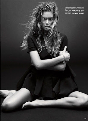
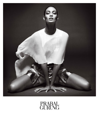
After searching through many different photographers i decided to research more into one names Daniel Jackson, I found his work quite simply stunning some are quite plain and straight forward but the lighting really makes them stand out. He also converts a lot of his images into black and white i will look into his work further to try come up with my own fashion photography shoot. These are some of the shots i would like to interpret into my work to create something of my own.

Daniel Jackson Shoots Triple Cover Story forVogue Germany

VOGUE GERMANY’S MARCH ISSUE 
Daniel Jackson ShootsPrabal Gurung SS13 Campaign


Calvin Klein Sportswear Campaign


Monday 11 March 2013

NQ Live- 09/03/2013

NQ Live- 09/03/2013


Album Cover

Album Cover

Model: Becky Wade

I decided to base my album cover on the soundtrack for the film Suckerpunch. Becky is posed as the main character ' Babydoll'. 

Plan for this shoot:
For my unit 23 project i decided to create an album cover for the soundtrack of the film 'Suckerpunch' i decided this after thinking long and hard what to do this project on. I though of many different album covers i could interpret into my own, but then they would still be similar so i decided on a film so i could make it completely my own as it already had a soundtrack but just the film cover for their album cover. I researched the music on you tube and came across the song baby doll sang ' sweet dreams ' this is what the basis of my shoot was aiming at showing.  I chose to use Becky Wade as the model as i thought she would fit the role well, she already has blonde hair and has similar features to the 'Baby doll' character.
I chose to use a white backdrop i thought this would make everything more bold and stand out more where as black would have made everything merge slightly with the dark colours in the costume.
I used two lights one either side one soft box and one with a snoot.
I used the settings on my camera IOS 200, 1/160 and  F5.
Following the photo shoot i edited the photo together using Photoshop 6 i added on the 'Suckerpunch' logo to my image. It took a lot of time for me to decide on using quite a plain background due to the tones in the image originally. I knew i defiantly wanted to add in the Suckerpunch logo so made a montage and added this onto the original plain image of the model. I tried diffident textures and colors for the background but in the end i think the neatural toning works the best, i wanted all the focus to be on the model and not what else is going on in the image. She is showing she is being strong and Independence and within the film ' fighting crime ' so i think the main aspect of the photo should be her. 

Friday 1 March 2013

Wide Angle

Wide Angle 

I took some wide angle shots within my house, I tried to find some interesting things to capture instead of doing buildings, however i found it harder then you would think and found myself stalking my cat around the house for a while as you can see from my image! 
I then decided to try the dolls house, which i think came out okay but due to the ground i couldn't quite get as low as i'd wanted then i tried my poster which was also hard to capture due to it always looking quite flat what ever angle you try and take it from. 
I quite like the one of the statue, I think it does it justice being shot from above using wide angle.


( wont allow me to rotate)

Thursday 21 February 2013

Evaluation of Studio Photography Project

Evaluation of Studio Photography Project

I think the studio photography project has been quite a difficult one to master, some bits iv'e found have been very enjoyable such as the glass photography i was very happy with the outcome and i'm pleased with my final image i have put forward for the final images. I think i have captured the colours well in this pictures of the glass mushroom and also captured the multi-coloured effect in the shadow as well. However in some of my other glass images i think i had the exposure slightly to bright, and this made the object merge in to the background more then id have liked.
Taking photos of the flowers i tried to carry out a different approach and made the images quite dark, as well as keeping them looking delicate i think on some of the images i produced it took away from the flowers and focused more on the barrel i had used to place them on, but then with the image i have chosen i went for a clear glass vase so you could see the colours coming through i think this worked a lot better. I used Photoshop afterwards to add in some highlights on the flowers and also used the dodge tool to add in some light to the glass vase.
I used Maya as a model for my low lighting shoot, however i think these images came of to strong for using a female model i think it is a very masculine light source. It's supposed to create an intimidating, bold photography however Maya is still looking pretty and feminine  Although i am very happy with the shot i have taken, and like the picture overall if i was to do this again, i would defiantly make these changes in which to use a male model and maybe add some more props such as hats and a blazer to create a real masculine scene.
To create my commercial photography i though long and hard about what type of style i wanted to create, i wanted to do something different and inventive. So i dug out some old dolls house furniture i thought i'd try recreate a home scene so it was something everyone could relate to. The meaning behind it was being female we all make a mess when doing out nails and its usually all over something we wish it wasn't! so i tried to recreate this by poring the nail varnish and placing it across the table. I then added some final little details by adding in the cup and saucer.
I decided to use a pocket watch iv'e owed for a while for my jewelry photography, It has a lot of detail on the surface and itself and chain are a gold bronze type colour. I thought about what type of textures to add to the foreground to make it strand out as well as to bring it out. I decided on using a metal iron to wrap the chain around and balanced it across some rocks. I took a lot of frames on this one, as i found it very difficult to not get a lot of glare on the watch i used pieces of card with tinfoil wrapped around them to try reflect the light away and i also tried using a reflector. In the end i was happy with the shot i took, but i then decided to edit it using lightroom, this is also a learning curve for me as lightroom is a new program in which i am using so i did some experimenting and came out with my final image. I really like the effect it has created across the image and think it really brings out all the different colours.

Overall i really enjoyed the studio photography assignment  and would love to do it again to see how much i have improved. I feel that some of my images are more stronger then others, but the five i have chosen i am proud of taking i think looking back on some of my older images i can see an improvement as well as areas to improve on. I think for the next assignment i will really work on shadows and iv'e found i have bits of glare i would rather get rid of in a few of my photographs so this is defiantly an area i can work on in my future work.

Studio Lighting- Task One

Studio Lighting

Studio Lighting is very popular with photographers today, studio lighting is a complete set up of lighting to provide exact levels of light and shadow to create a desired effect within the final image. A full studio lighting set is made up of these pieces of equipment:

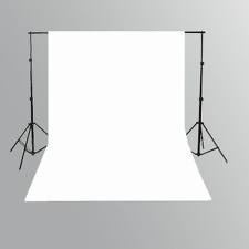
Backdrop: These can be any of the desired coloring however normally they are white or black.

Lights: These can be at a different wattage and can also be adjusted within the setting on the side on the box.

Soft boxes: These defuse the light, which in turns softens the shadows produced.

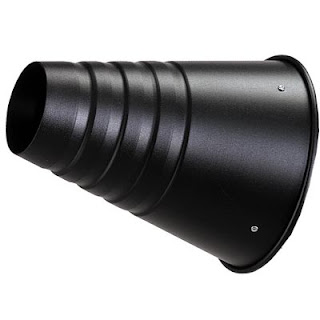
Snoot: This allows us to control the direction of the light beam, snoots can also isolate a subject when using flash.
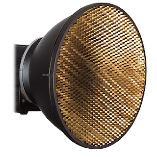
Honey Comb: This narrows the light beam to a circle with soft edges.
Flash Adapter: These are used to as the flash guns go out exactly as you take the picture.

Umbrella: These also defuse the light source like the soft box does.

I have been learning a lot about studio lighting and how it works, Our eyes automatically Control the intensity in which we see by opening and closing it's iris, where as a camera uses three adjustments to control intensity. These are the aperture, shutter speed and the sensor speed ( IOS).
From what i have learnt in lesson and through research i can see that there are three characteristics of lighting  these are light intensity, light direction and light colour.

Light Intensity, Is the quality of the image, whether the light is perceived as hard or soft and how much light is hitting the object. Soft light is more overall lighting, using soft boxes or umbrellas, where as hard lighting is created using equipment such as a snoot to create a strong beam of light and strong shadows. We can manipulate the light by adjusting the aperture and shutter speeds within the settings. We could used use different filters or by using other sources of artificial lighting.
Light Directions, is the angle we use the lighting we can make something look very three dimensional as well as two dimensional and flat this depends on the object which we are photographing. We can use different equipment to create different textures and effects. We can control the way the light is reflected carefully to create the desired effect.
Light Colour, is to do with the colour balance white light has a colour cast, as humans our eyes automatically adjust to this where as on a camera sensor it does not. We can adjust the colour balance on the camera in the settings before we take an image, or afterwards. These include Florescent Lighting which is usually a green tinted colour, Incandescent Lighting which has a low colour temperature so this is an orange colouring. Candle light is similar although this is more of a deeper orange colour. The colour balance can also be adjusted in photoshop after the image has been taken.

Tuesday 19 February 2013